|
https://docs.google.com/a/shorian.org/forms/d/1A85hNM55k7m6WhP9qGjA4XxSd75I-mVnSsxIqPS6Lwc/edit
0 Comments
During creating the index page of my website, I ran all of my power. Generally, it is a pretty hard work for me. Firstly, the feature that i like most is the table. By using a table, the content of my website got much more clear than before. And there's a feature I hate, that is the logo. I have spent so much time on painting and fixing the logo, but I lost points finally because of logo. I have to put my subtitle and my logo into one file, but I totally forgot it. And it forced me to do is before the check or works. It makes me feel bad. In the other hand, although I have checked all of the color, and change to hex codes, but i missed two, which i thought it is a kind of font!! Finally I got a 93/100 for the first part, I will be more hardwork, and my goal is to keep this score to the end of the semester! 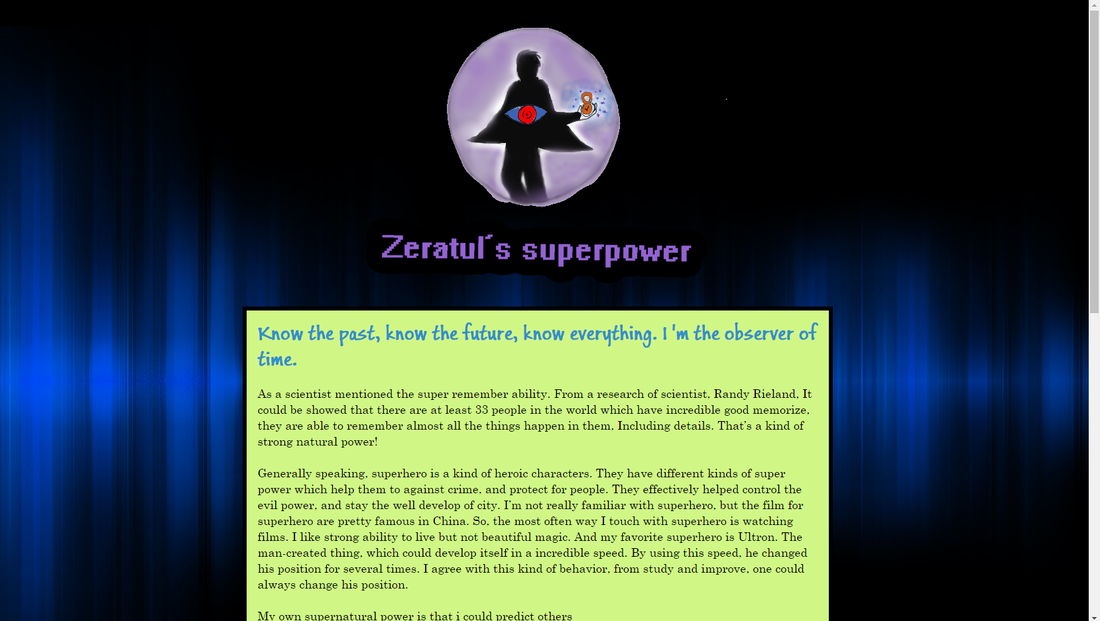  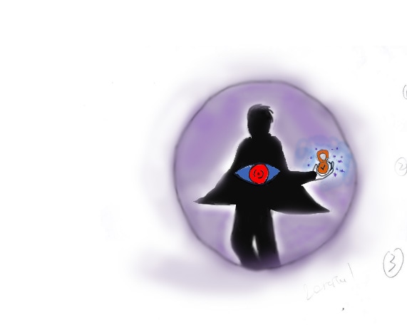
The main color of my logo is purple and black, the purple represent for mystery and magic, and the black means a kind of shadow, my superhero living in the shadow, lives lonely and traveling the time. And the hex codes are #9370DB for purple and #000000 for black. The slogan: Know the past, know the future, know everything. I 'm the observer of time. Firstly, i used brush and changed it as a pretty thin thing to make it's outline clear. Then, i used the opacity .The opacity is the most useful tool when i did my rendering process, it always create a good feeling of picture. For make it a little psychedelic, I did some tiny change to the pictures by using blur tool. Finally, i use the selection tools and hand tool, made a regulation to part of the logo.
|
|||
